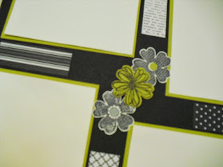
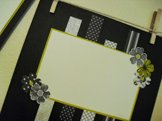
I have always thought that black and white cards, and layouts are so striking. So, this was one of the layouts that we made at my Scrapbook Your Life class this past month. I have been thinking long and hard about what kind of pictures would look good on these pages. Should it be black and white pictures of me as a baby, or prom pictures of my daughter through the years, or should I recolor a picture of Sam and I and feature that. Once you create a layout it is almost as much fun to figure out what to put on the finished product.
 |
| Flower accent |
 |
| Second page accent
What pictures would you place on this layout?
|


No comments:
Post a Comment